By starting with why
and specifically the excuses
why people don't vote
We were able to make
who, what, where, when, and how
-- easy for all
We challenged ourselves
To build a world-class accessible and effective electoral experience.
To create a more digestible visual approach, narrative, and tone.
To put the elector first, and rebuild internal processes to match.
To better inform and educate Ontarians once and for all.
To get it right, and get right to it.
A recap covering all aspects of the work created
User Testing
An early critical step with this complete brand rebuild was identifying, from a first-principles perspective, the impact of inclusion as a critical KPI.
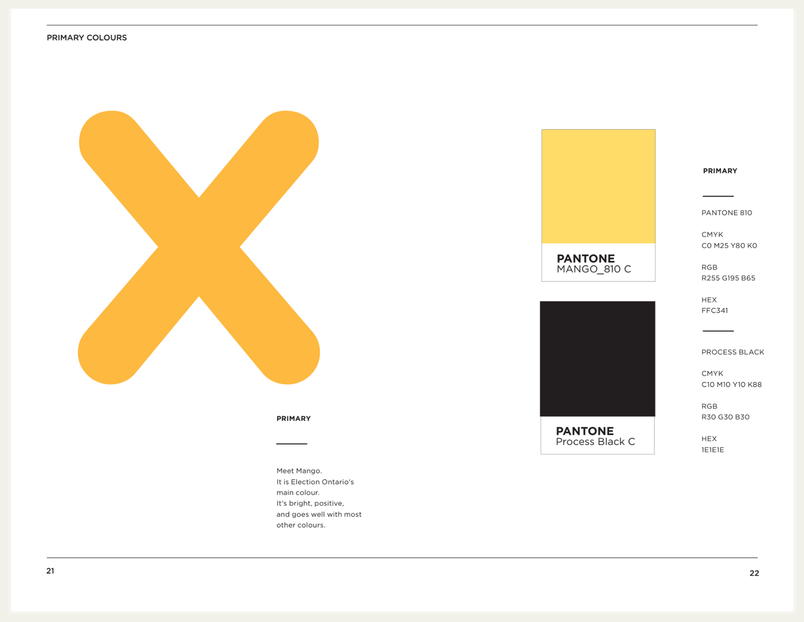
Comparative colour treatments were explored and tested with the general population to find a happy non-bias medium between political party colours. This required the Ontario government's review and approval.
AODA studies were conducted for colour, contrast, and legibility of old brand elements of various sizes. Digital requirements were a new layer of testing categories to review the old logo against. These resulting data points directly impacted the final designs of all deliverables.
A11y recruitment, scripts, assets, and testing was a collaborative effort with the government and labour boards. This was conducted years before many remote and A11y recruitment and testing platforms were readily available.
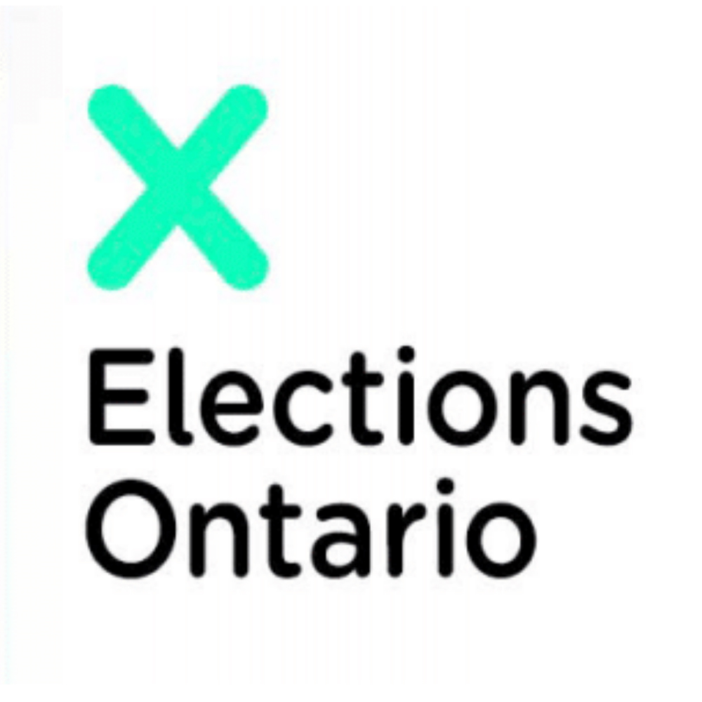
Ex: Original logo vs initial new design. Green failed testing.

Design System
Everything was rethought, even how we articulated what would become the design system.
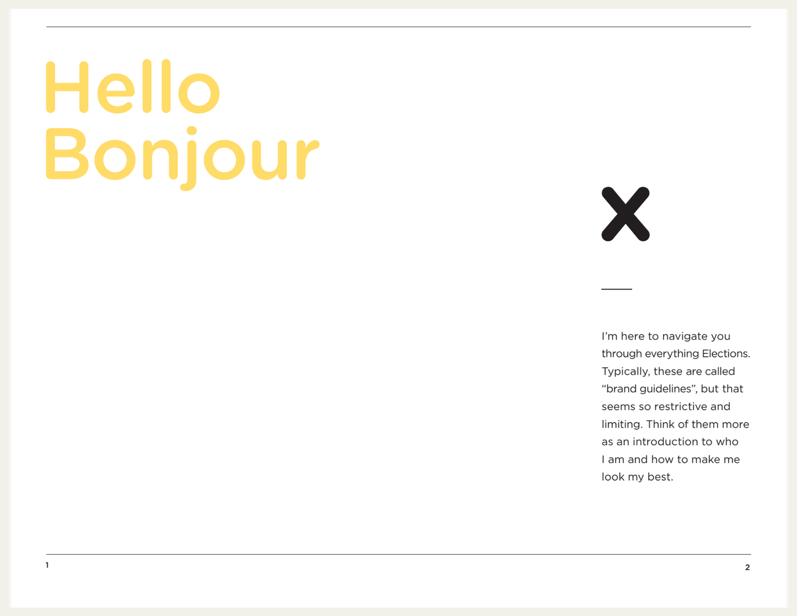
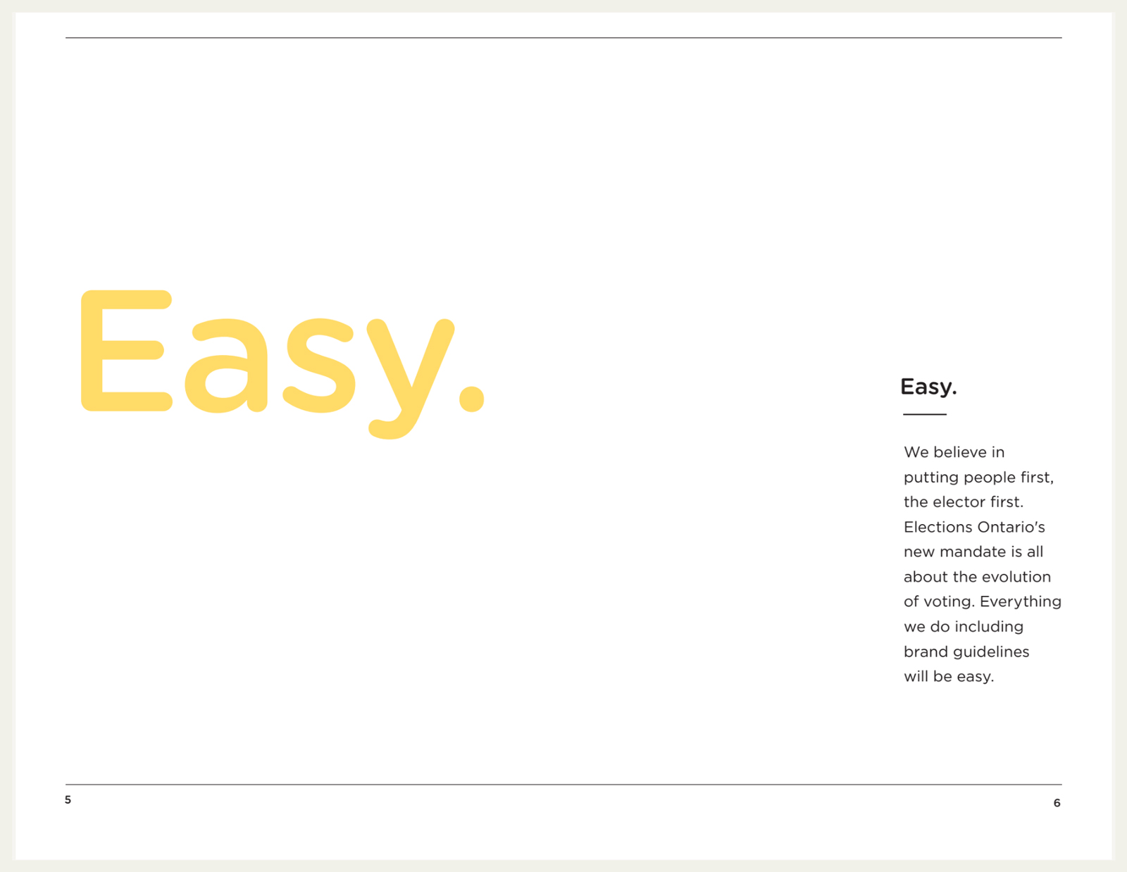
An example of our copy introducing the guide:
"I’m here to navigate you through everything Elections. Typically, these are called “brand guidelines”, but that seems so restrictive and limiting. Think of them more as an introduction to who I am and how to make me look my best"
We Make Voting Easy.
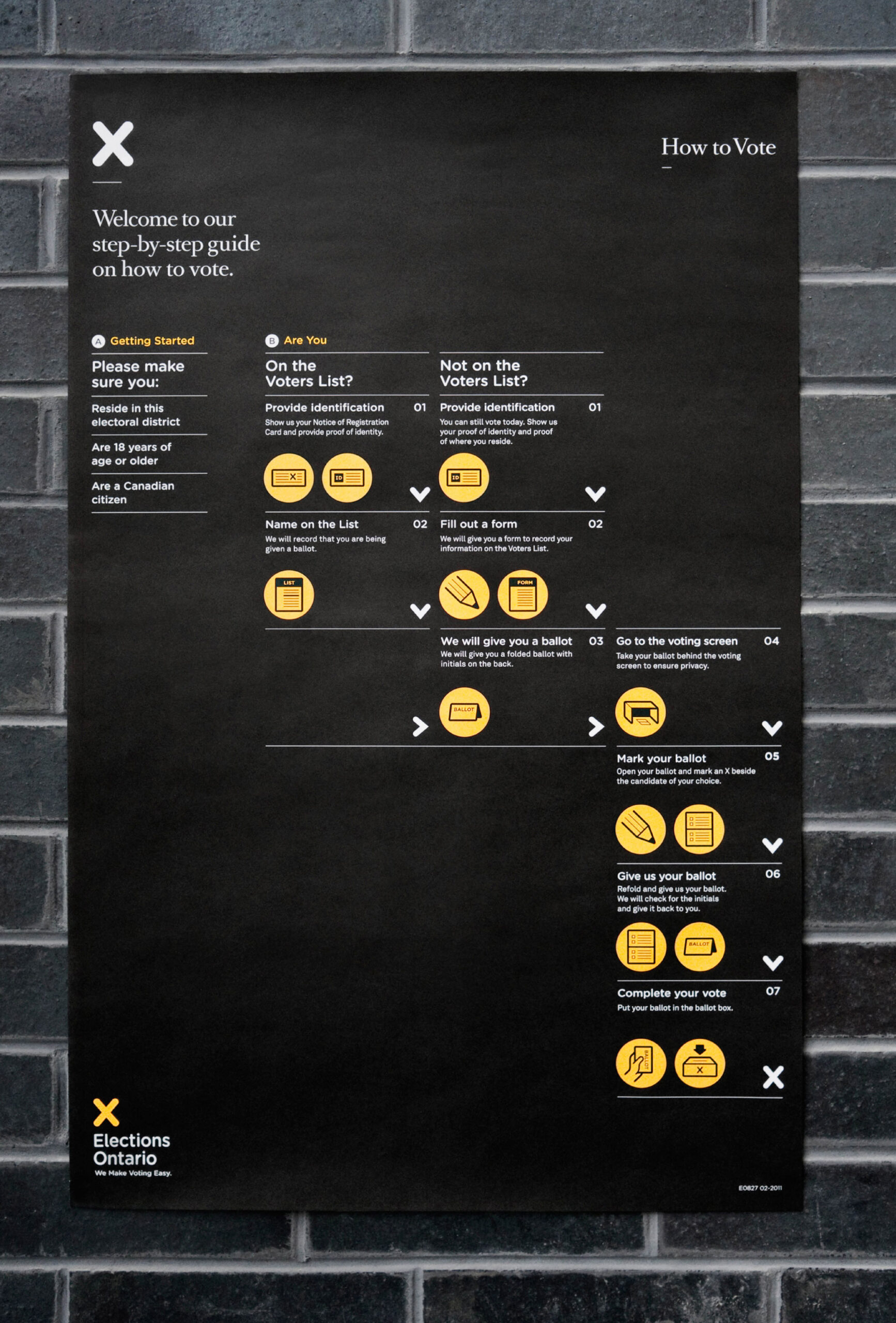
We made voting easy on voting day by making the steps easy to understand. We redesigned a set of universal icons that would be easily understood regardless of native tongue or literacy level.
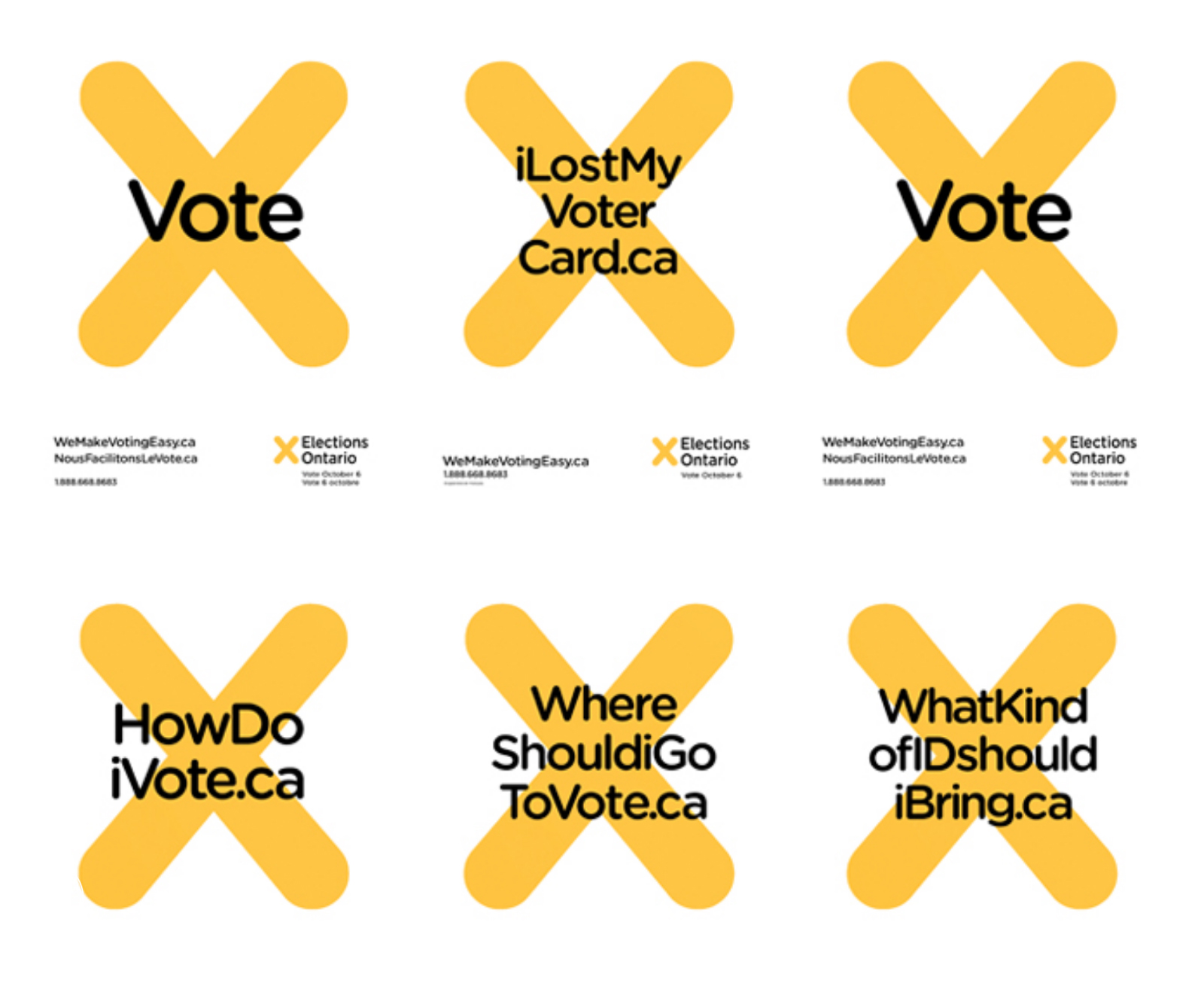
We made the things that people thought were hard about voting easy by turning them into URLs and using them as headlines in OOH, wild postings, and Online Media Ad units. Each and every one of them (68) would send you to a deep-linked page on Elections.on.ca that would provide answers to the issue it was about.
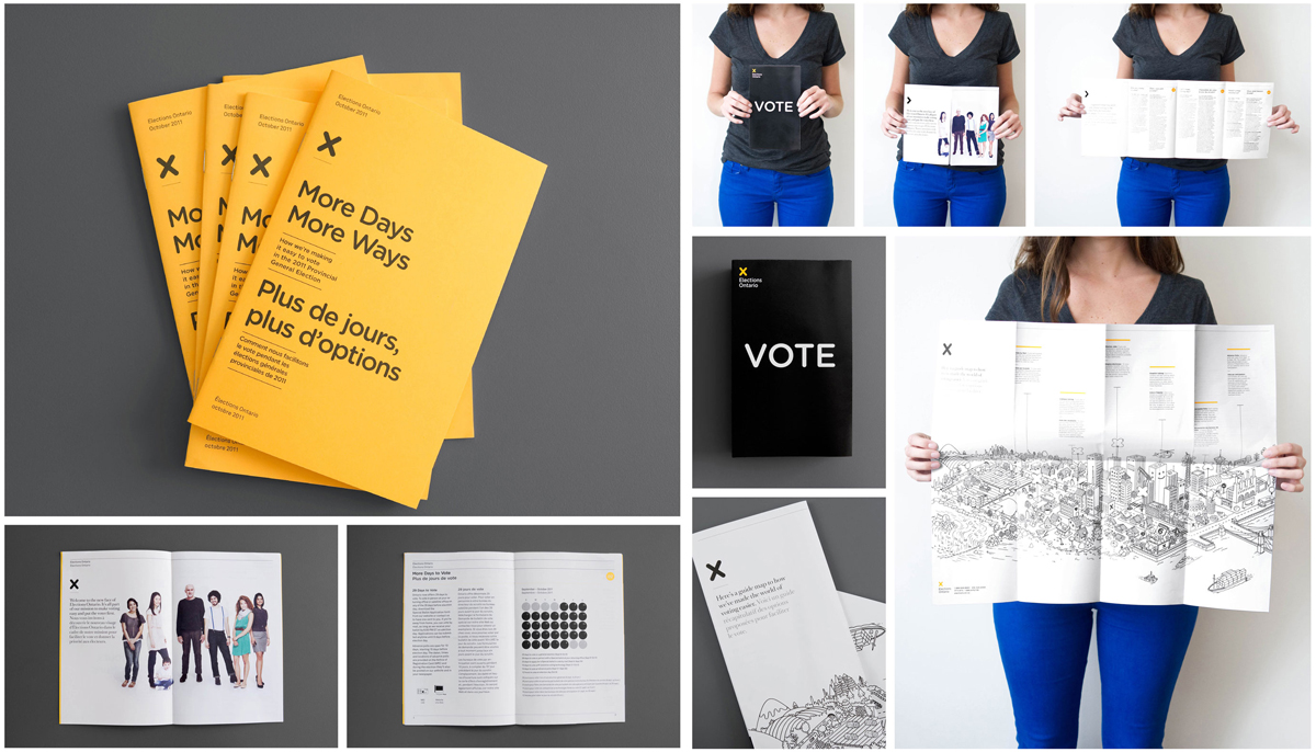
We made an understanding of the who, what, where, when, why, and how of voting by redesigning the Elections Ontario Guidebooks and creating the ‘householder” — a comprehensive guide, that goes to every household in Ontario.
We did pitch them a digital experience but in 2010, the system wasn't ready to support it.
So we made the householder inviting, easy to read, and easy to remember with a whimsical yet informative voting map
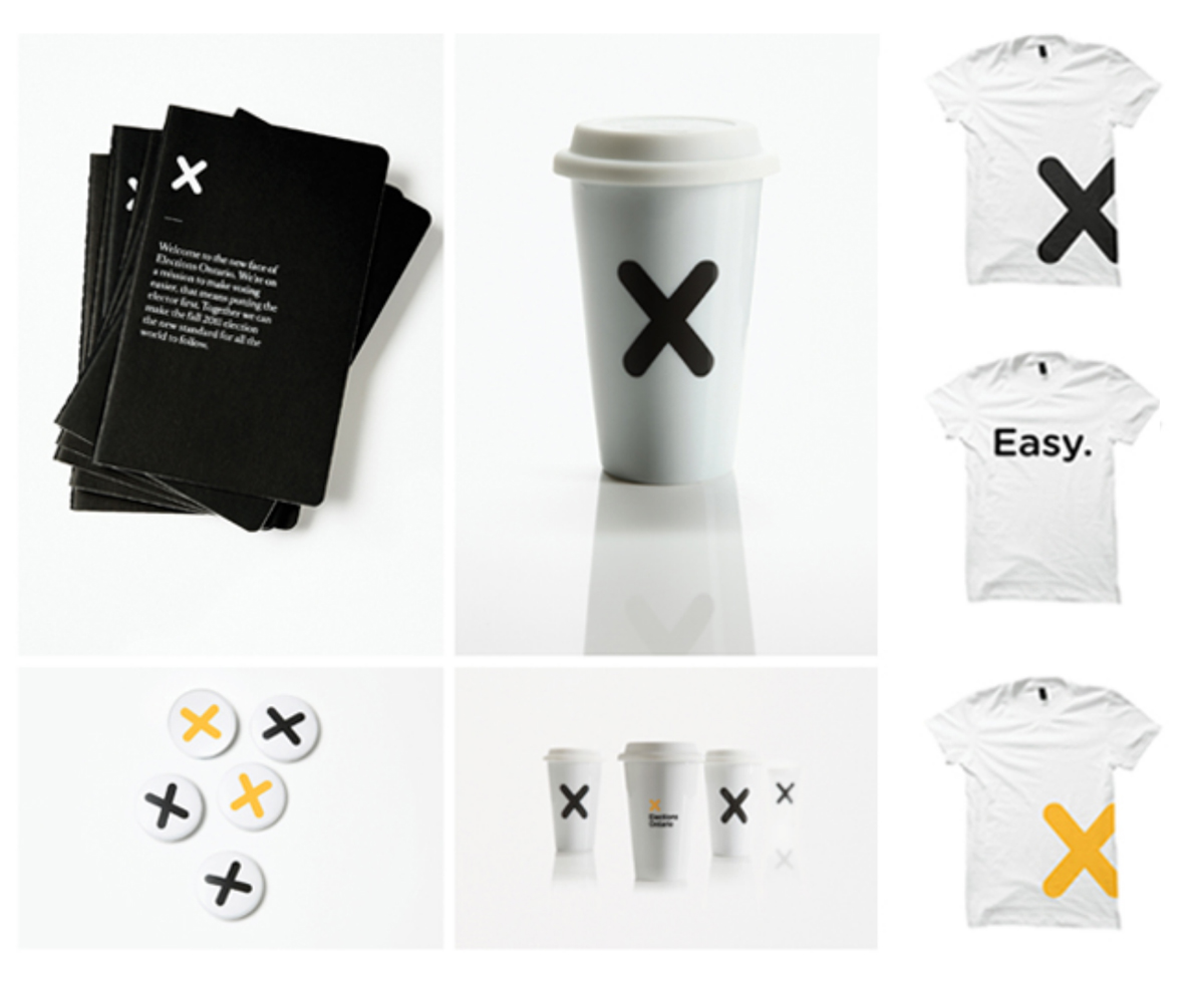
We made accessing election information easier by redesigning all the collateral, from their voting handbooks and voter information guides right through to the voter registration cards.
Easy to read, and easy to understand.
How to Vote
Onsite Step-by-step Poster
We make voting easy
We made voting easy on voting day by making the steps easy to understand.
We redesigned a set of universal icons that would be easily understood regardless of native tongue or literacy level.
Role
Digital CD
Client & Year
Leo Burnett
Elections Ontario
2010
Responsibilities
Digital Strategy
Concept Generation
Digital AD Oversight
Client Presentation
User & A11y Testing
Touchpoints
Elections.on.ca
Online Media Units
Unique URLs
iPads on location
OOH & Mass media
Awards

One Show: Gold Pencil. Design - Corporate Identity / Campaign
