Avatar
Citi's digital tone & voice platform
New items were often best shown as videos to more easily have artifacts that could be easily shared amongst execs while not losing the nuances often covered in presentations.
Avatar
Avatar is not a design guideline, but rather a program that is iterative and continuous. The four pillars of the Avatar program are:
1. Research
Before, during, and after
2. Design
Clean, linear, well organized, elegant
3. Function
Bring content to the user, don’t push content at the user
4. Values
Be human, helpful, and expedient
A recap covering all aspects of the work created
Technology by itself is not the real disruptor
~
Being non-customer-centric is the biggest threat to any business.
Goals
Create a human-centric, elegant design vessel, for the brand that will last many years.
Create a program that will change people’s impressions.
New items were often best shown as video to more easily have artifacts that could be easily shared amongst execs while not losing the nuances often covered in presentations.
Engrain "S.H.I.N.E." across Citi.
Simple: Easy to use, Intuitive, Transparent
Human: Customer-Centric, Instill Confidence, Friendly Tone
Inspiring: Motivating, Facilitating, Empowering
New: Elegant Design, Innovative, Single Product Flexibility
Enriching: Rewarding, Informative, Insightful
Ex: Before and after Avatar redesign. Cerca 2011/2012
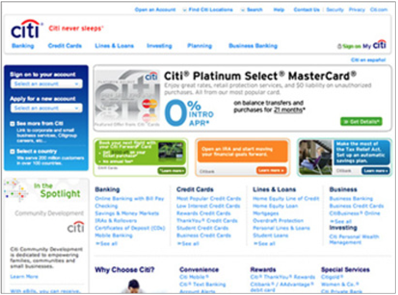
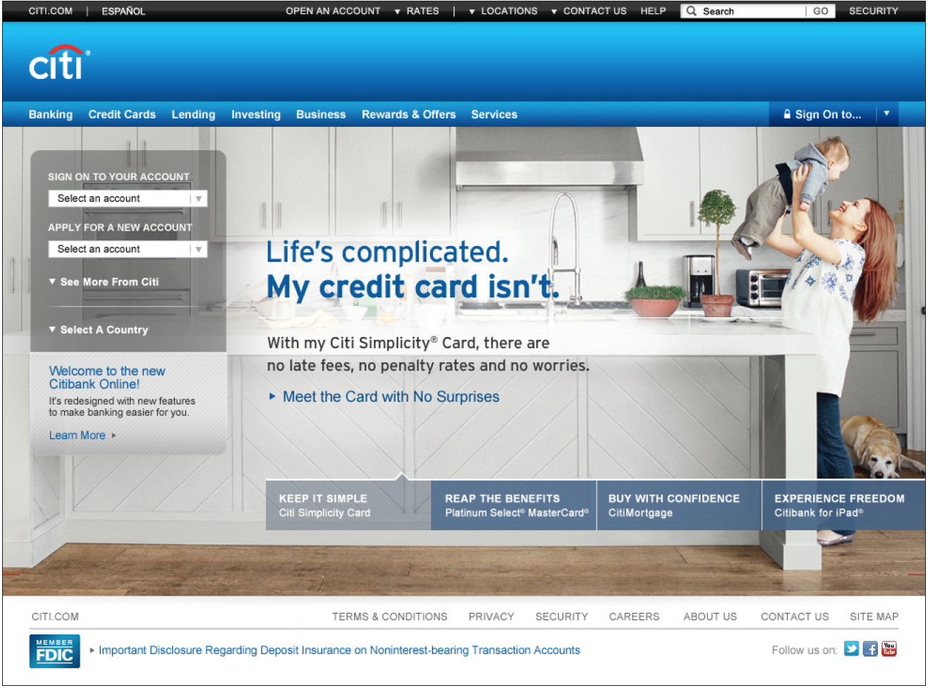
Scope
Avatar started as a web evolution, but its roadmap was to weave its way into all of Citi's digital and physical touchpoints.
Over 300 pages, growing and evolving weekly. The living Avatar document contained traditional design system atomic components but also contained flows and tasks to be done which spaned many key moments in a user's journey.
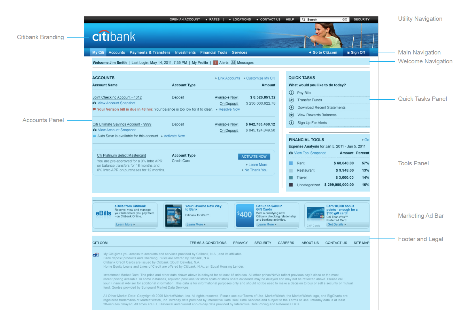
1. The three main panels on the Dashboard consist of: The Accounts Panel, Quick Tasks Panel, and Tools Panel.
2. Above the Accounts Panel there are two calls-to-action which are: Link Accounts and Customize My Citi.
3. Accessing the ‘Customize My Citi’ allows customers to customize their experience. This includes the ability to reorder, hide/show, and rename their accounts on the Dashboard (the ‘My Citi’ page).
4. Quick Tasks only appear on the Dashboard and launch overlays. NOTE: Links accompanied by an icon open overlays on the same page. Links with carats (i.e. Quick Links) will send the user to another page.
5. The Marketing Ad Bar is accessible at the bottom of the Dashboard. No more than four ads are completely visible at one time. A scroll function allows customers to scroll left and right.
6. Arial body copy is set at 12 pt regular.
7. Legal, footnotes, disclaimers are set at 11 pt. [USA1] Note: The dollar values are set very high to accommodate for the Global-View of Accounts (GVA) three-digit country code and I.T.’s backend dollar value. These dollar values d not appear for customer-facing communications.
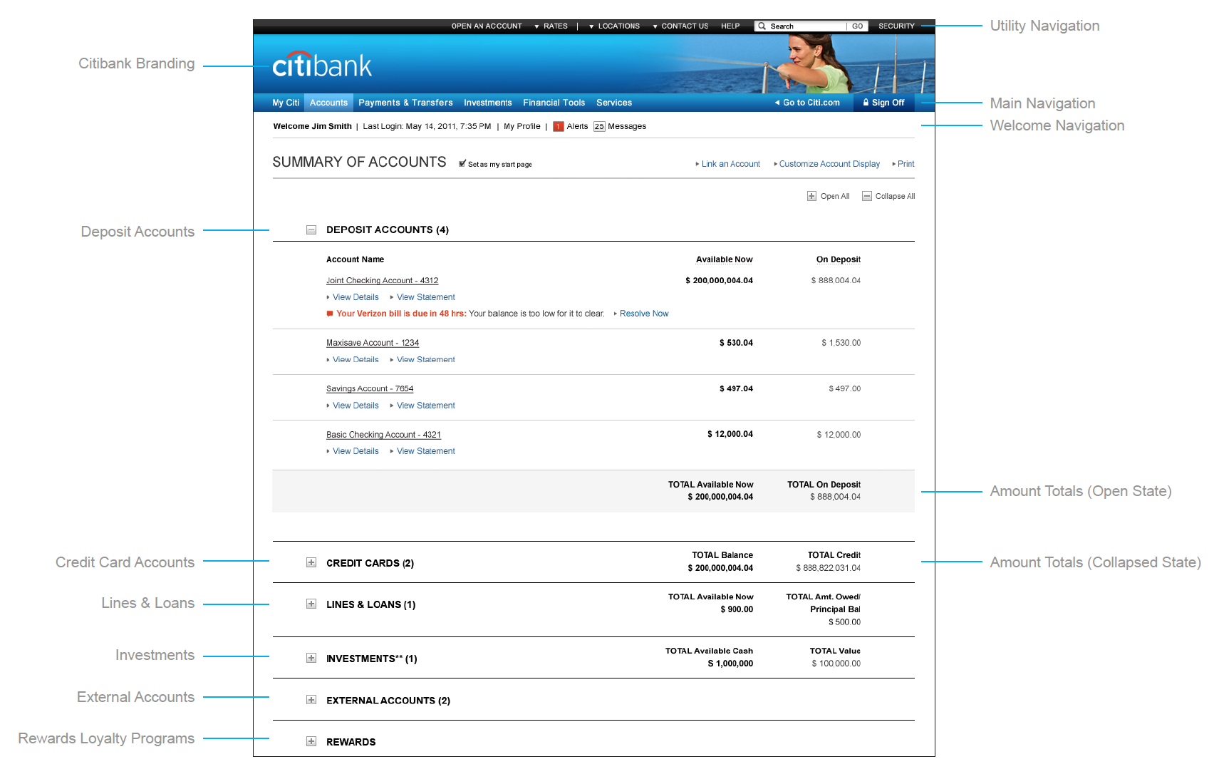
The Summary of Accounts page can be set as the start page by checking the box to the right of the Header.
The Summary of Accounts page (versus the Dashboard), allows customers to view their bank accounts grouped by account type. These account groups include Deposit Accounts, Credit Cards, Lines & Loans, Investments, External Accounts, and Rewards.
The experience allows customers to see their total account balances by type. External accounts will not be totaled.
In User Testing, it was found that customers had difficulty scanning their information from left to right. The left/right margins have increased to support this feedback.
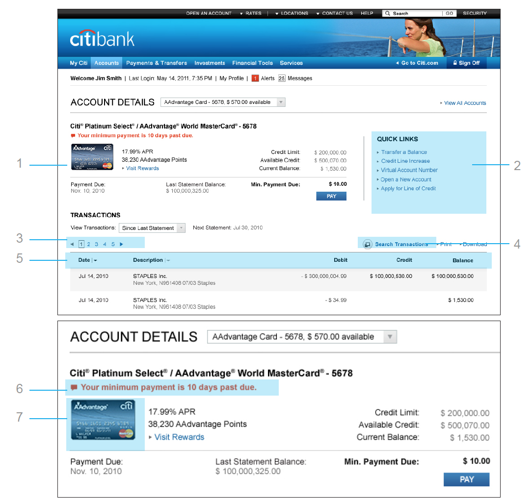
1. The Account Detail Panel
2. The Quick Links are located in the right panel and contain a maximum of 5 links. Quick Links will take the user to another page.
3. Pagination has been added and the maximum number of listed transactions is 15 per page. A new section about Pagination has been added to the experience framework. (Refer to Table of Contents for Pagination Section.) UPDATE
4. Future scope will include a transactional search function.
5. Sorting button added based on the Style Guide table sorting.
Account Detail Panel
Specific account details are located in the top left panel.
6. Account Warnings or Overdue Alerts live directly below the account name. This replicates how it is seen on the dashboard.
7. Card art is displayed on this page to care for future business requirements.
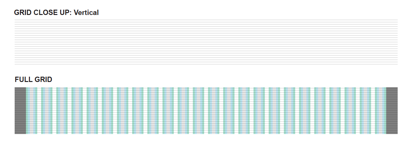
A move to correct vertical rhythm
New to the grid is the 6 px baseline structure to work with vertical space.
This system has three advantages:
1. Simplifies the design process by removing the “chance” factor (no more questions);
2. Decreases the time spent positioning elements, with FED;
3. Increases the feeling of organization in our design by articulating all the graphic elements with type.
Avatar was one piece of a broader set of artifacts that helped build internal alignment within a behemoth of a company that is over 200+ years old, steeped in its own traditions -- both good and bad.
Role
Digital CD
Client & Year
Critical Mass
Citi
2012
Responsibilities
Digital Strategy
Concept Generation
Digital AD Oversight
Client Presentation
User & A11y Testing
Touchpoints
MyCiti
Accounts
Payments & Transfers
Investments
Financial Tools
Service Center
